2025 OCSC Design Direction
Objective: Create a consistent, versatile, and scalable design system that strengthens OCSC’s identity across every platform for the 2025 season.

-1080x1920.jpg)
-1080x1350_1.jpg)
-1080x1350.jpg)
-1080x1920.jpg)

DEVELOPMENT
v1
v3
v10
v11
v13
CHALLENGE
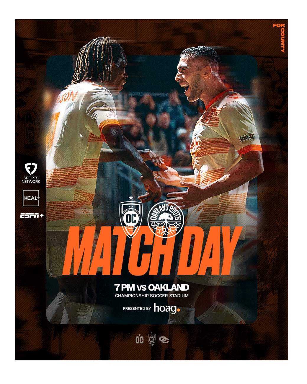
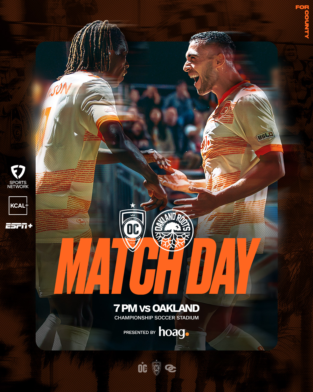
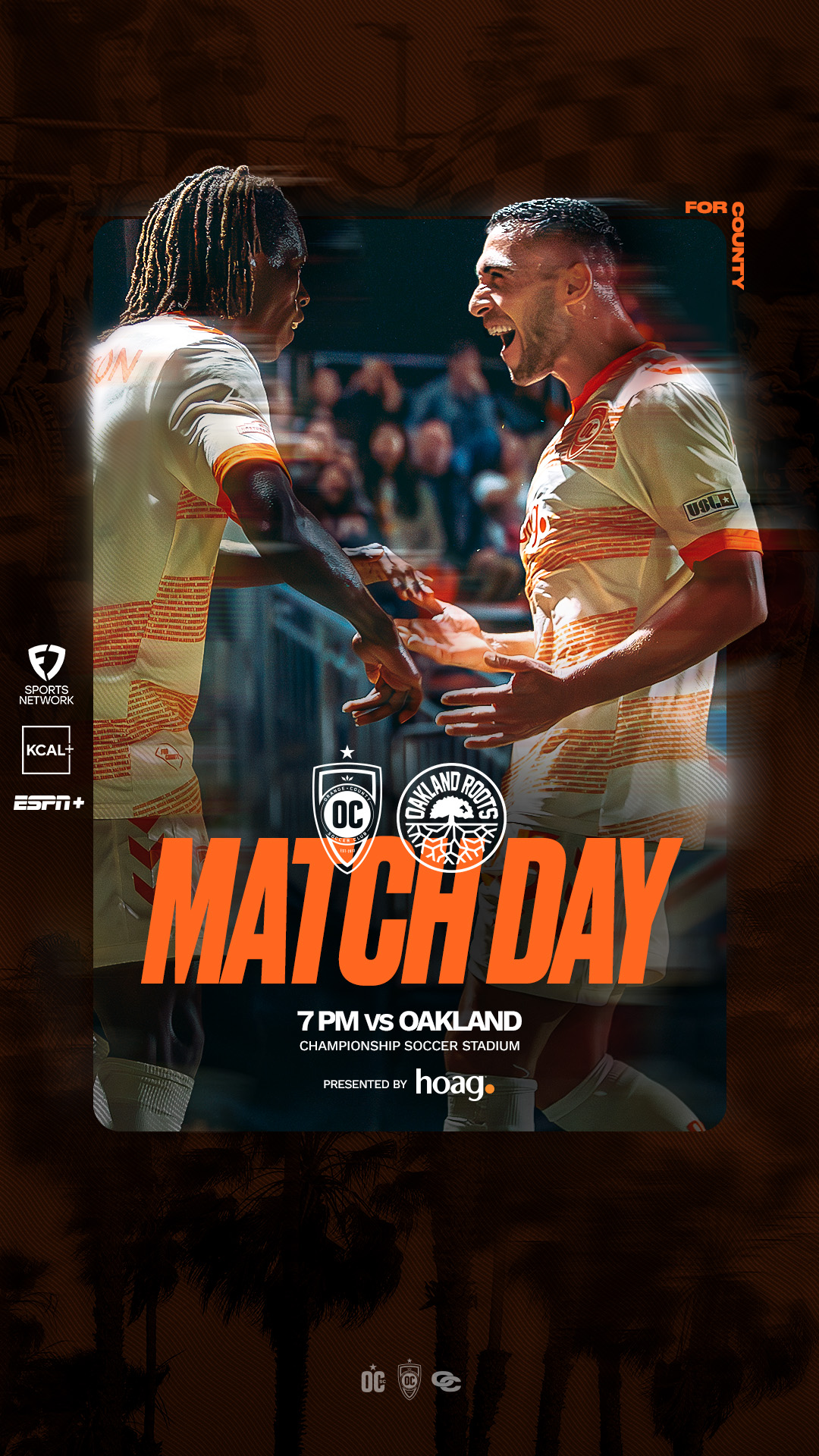
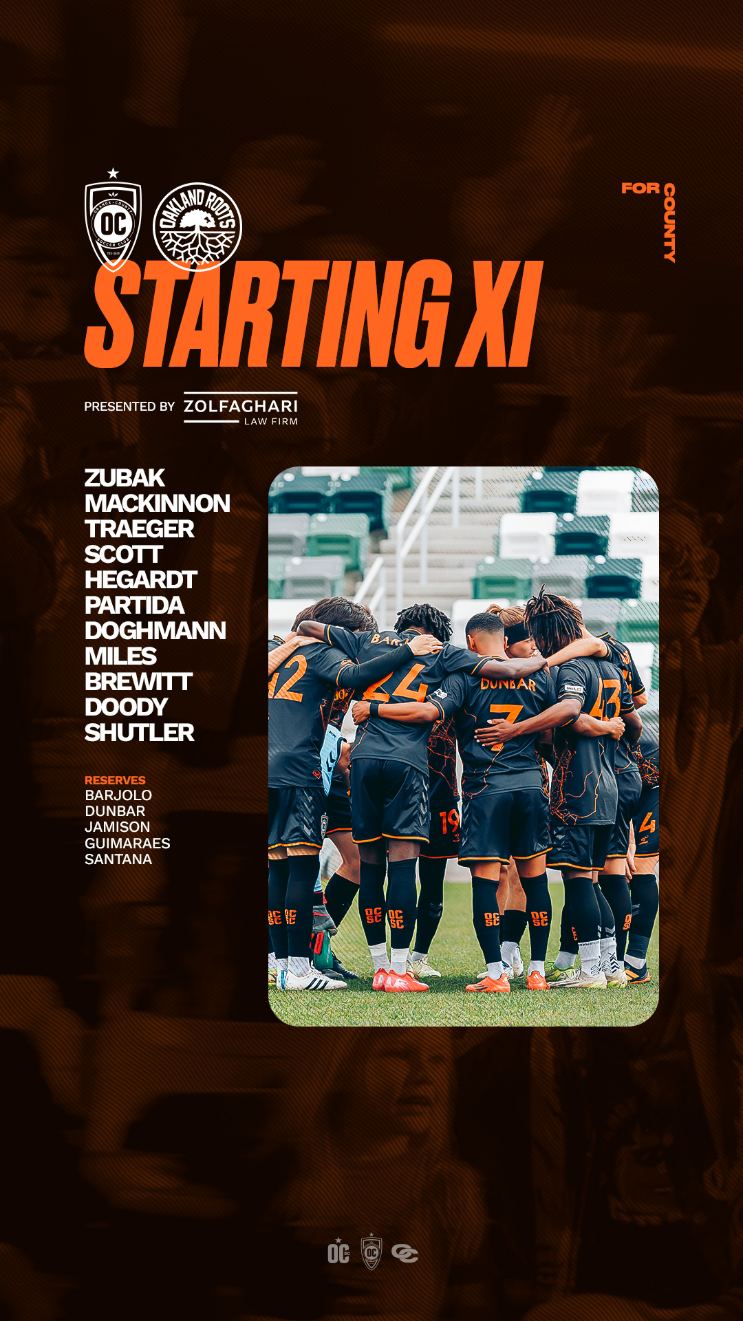
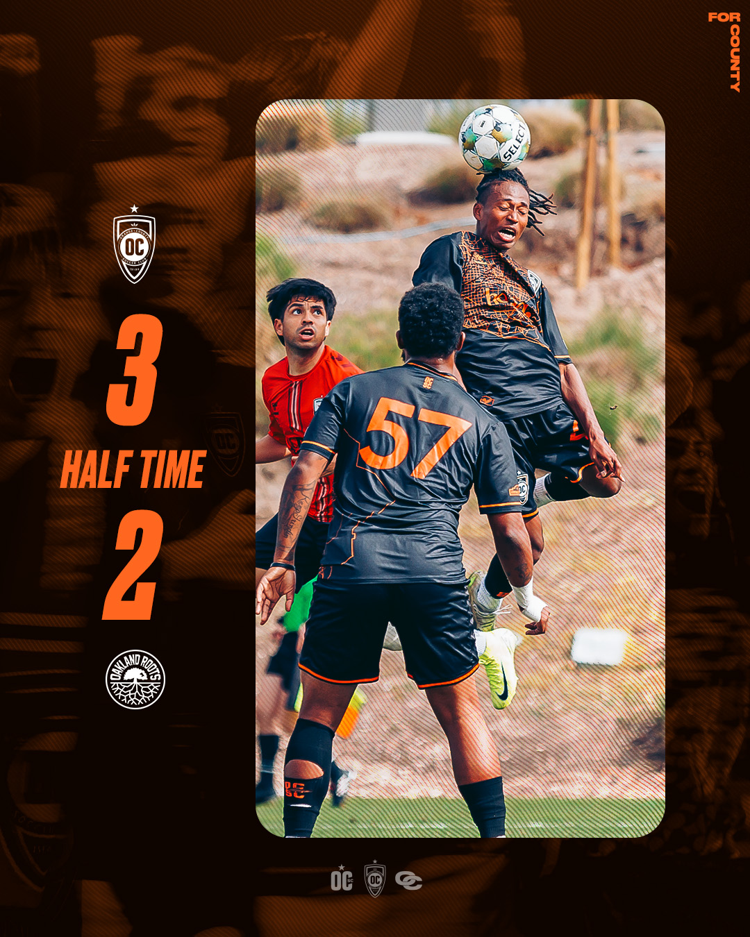
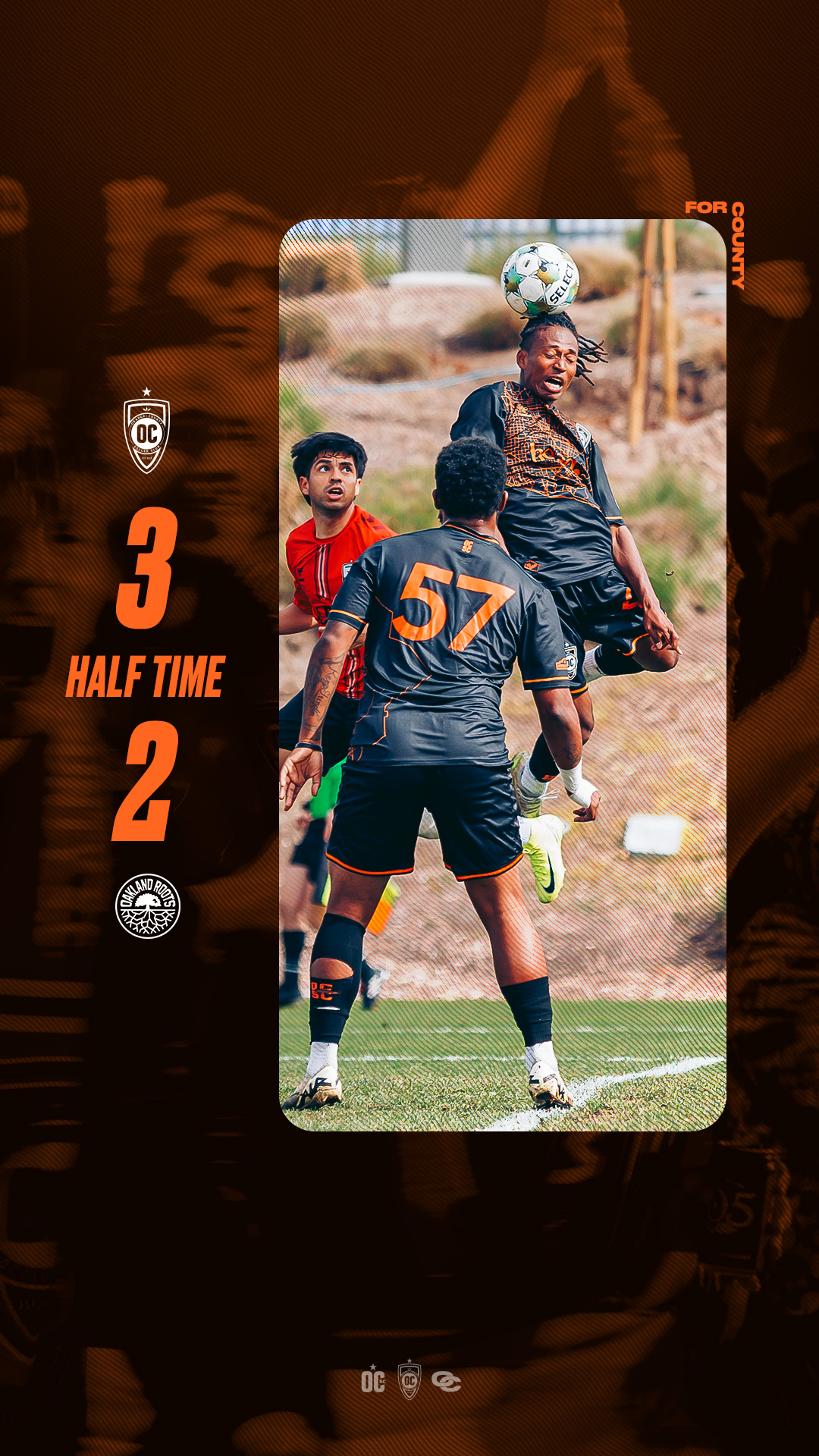
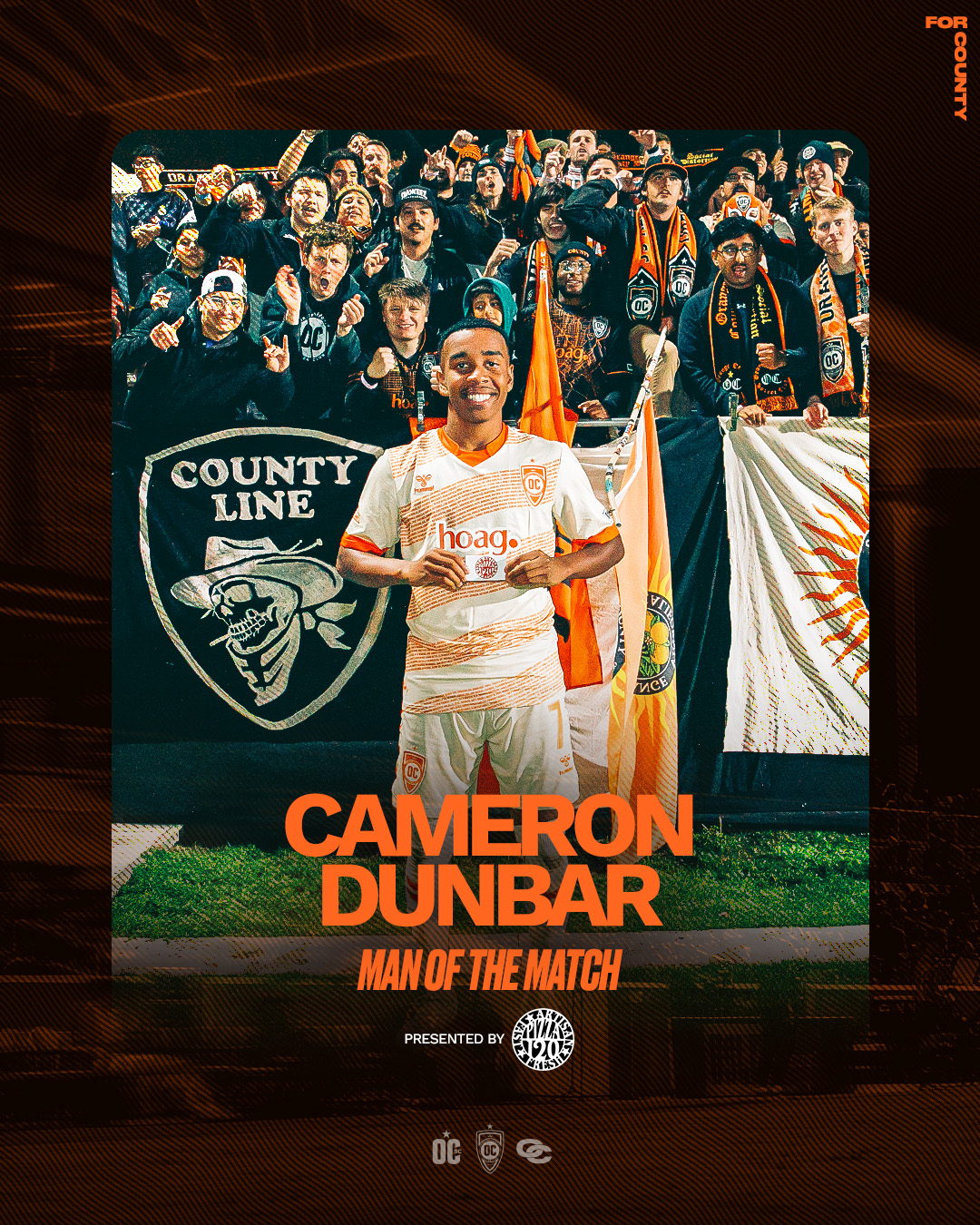
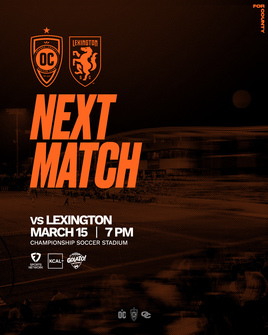
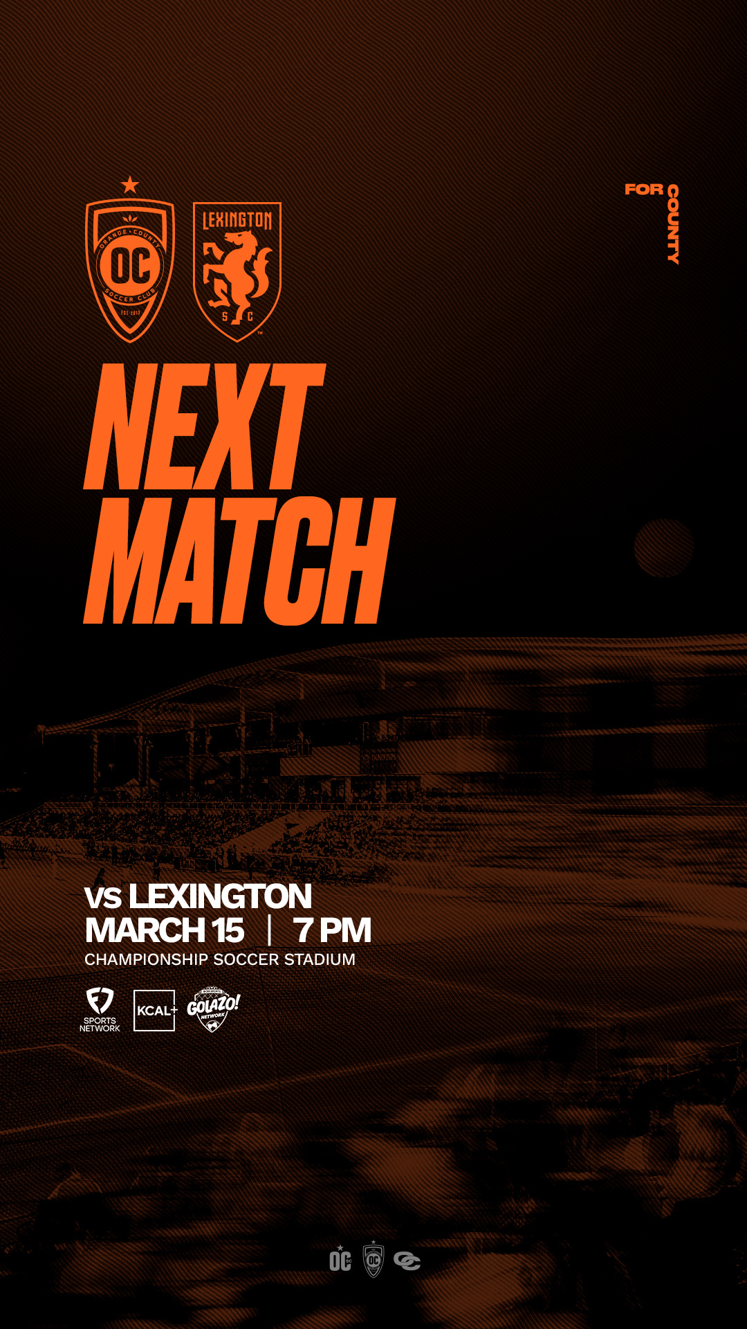
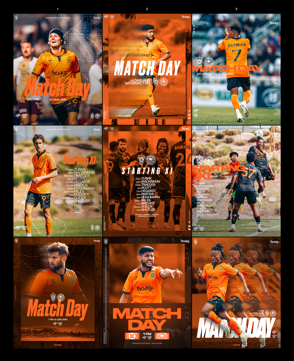
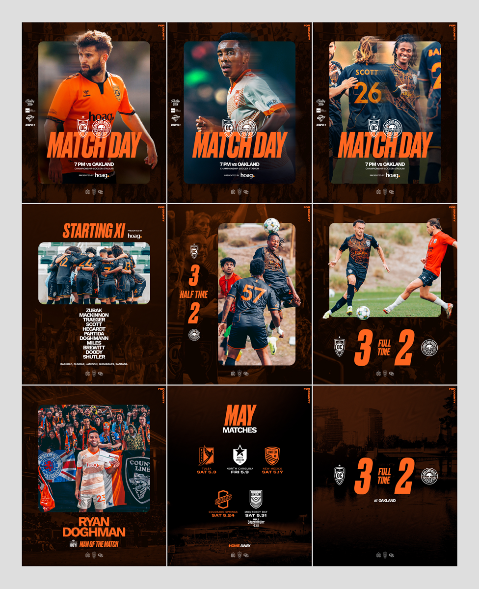
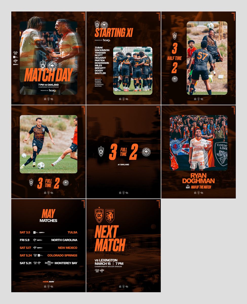
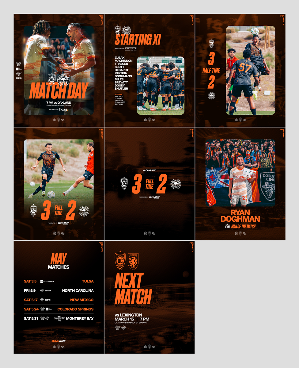
Heading into the 2025 season, we needed a refreshed brand system for Orange County SC that worked across both digital platforms and in-stadium screens. The challenge was twofold:
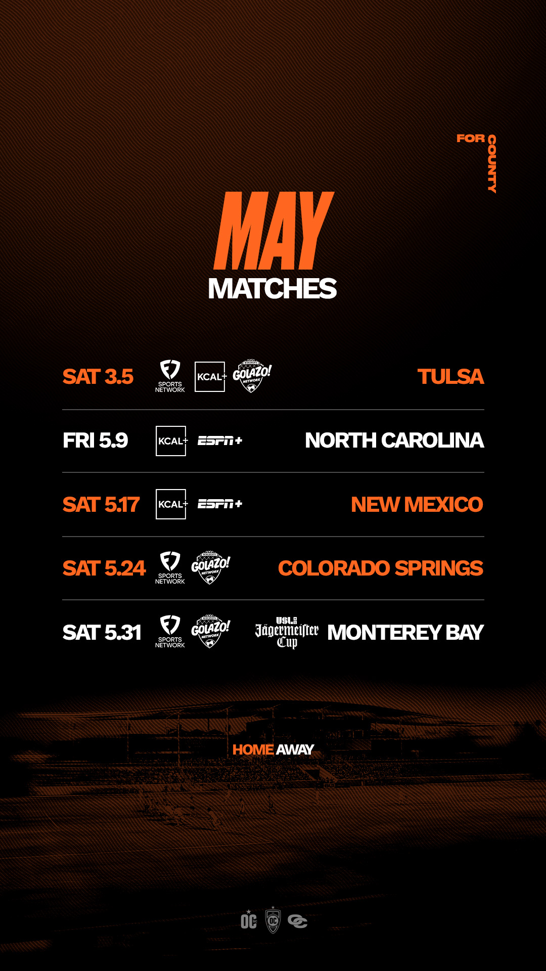
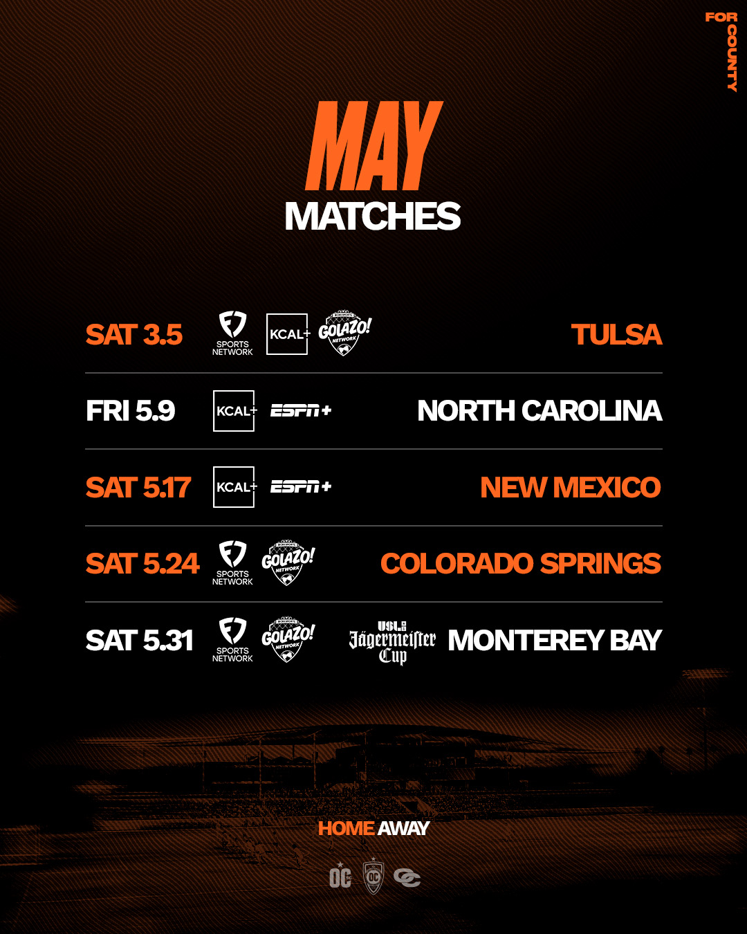
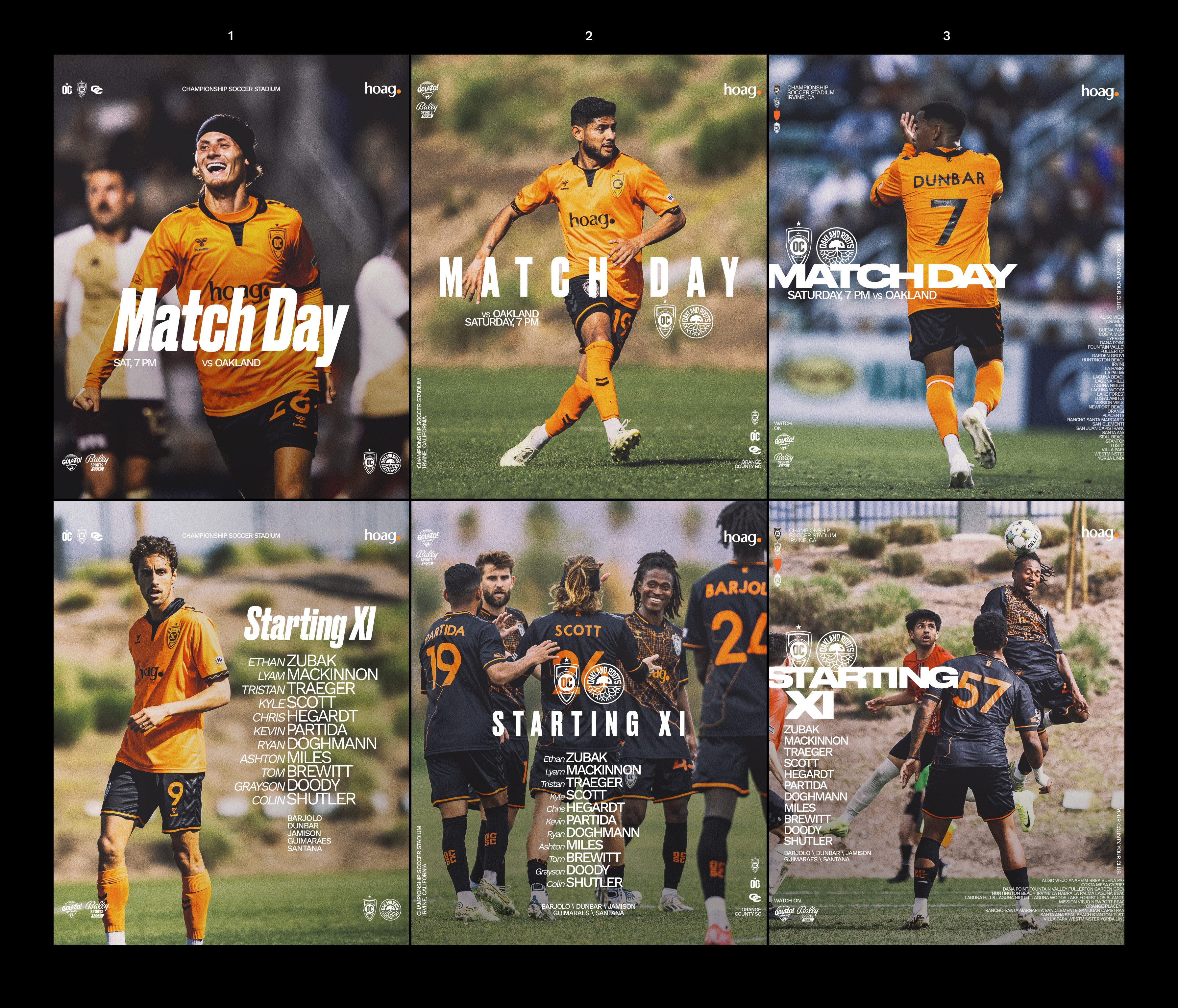
Versatility: Templates had to flex every week across Full Time, Half Time, Man of the Match, and Matchday applications, while also scaling to all the other graphics used throughout the season.
Consistency: Before I joined OCSC, the brand leaned heavily into orange and often overdid it. Over the past two years we have rebuilt the palette, brought back balance, and created a visual language that tells our story while showing where we want the club to go.
DIRECTION
The design evolution was guided by three principles:
Designing with Purpose
Every line, detail, and element needed a reason to exist. After pulling the brand back to its essentials over the last two seasons, the focus is now on expanding slowly, thoughtfully, and staying true to our identity.
Hierarchy and Impact
Typography and logos were scaled up, with overlapping treatments that created a bold layered look. This carried energy while solving a key visibility issue uncovered during videoboard tests, where earlier designs were hard to read from across the stadium.
Consistency
A unified guide system was embedded across all PSDs, ensuring fade-to-transparent effects and image placements aligned perfectly. This gave us a framework that preserved brand flow but still allowed flexibility in imagery and messaging.
EXECUTION
Delivered 40+ layered PSD templates across all key ratios (4:5, 9:16, 1:1, 16:9).
Built-in guides for photo placement, fade zones, and text/image scale recommendations.
Refined Camera Raw preset, reduced from 100% to ~70% intensity, cooled slightly to balance skin tones, paired with light and contrast adjustments. This created a tonal base that was consistent but still left room for creative tweaks.
RESULT
You tell me but I think it feels elevated from the 2024 season while staying instantly recognisable. WIth hidden gems for those who know.
CLIENT
Orange County Soccer Club
SERVICES
Creative Direction
Brand strategy