2026 OCSC Design Direction
Objective: Build a system that scales across every platform, but one that's unmistakably Orange County, not just another club.


CHALLENGE
Sports branding has a sameness problem. Strip the crest and the colours and most clubs could swap places overnight and nobody would notice. The job wasn't just to make something scalable, it was to make something that could only belong here.
DIRECTION
So I went back into Orange County's actual history, not the tourism poster version. What kept surfacing was punk. The bands, the flyers, the DIY scene that shaped this place long before it got known for beaches and gated communities.
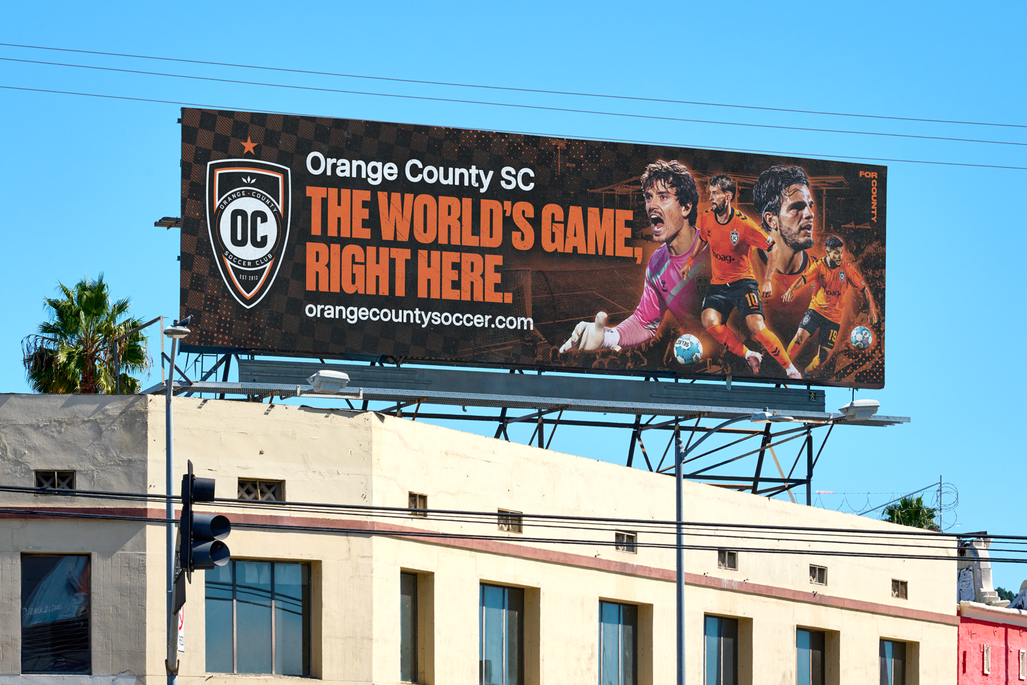
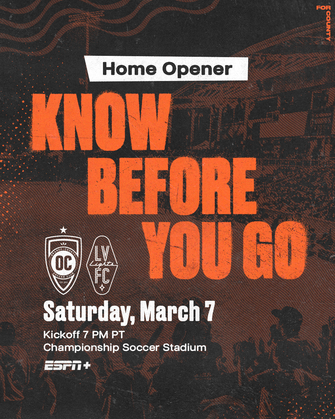
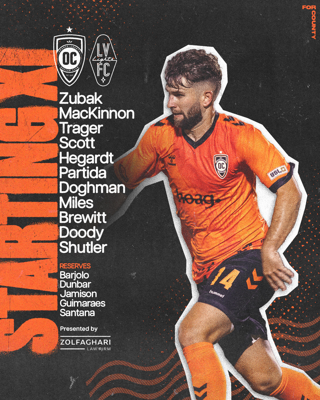
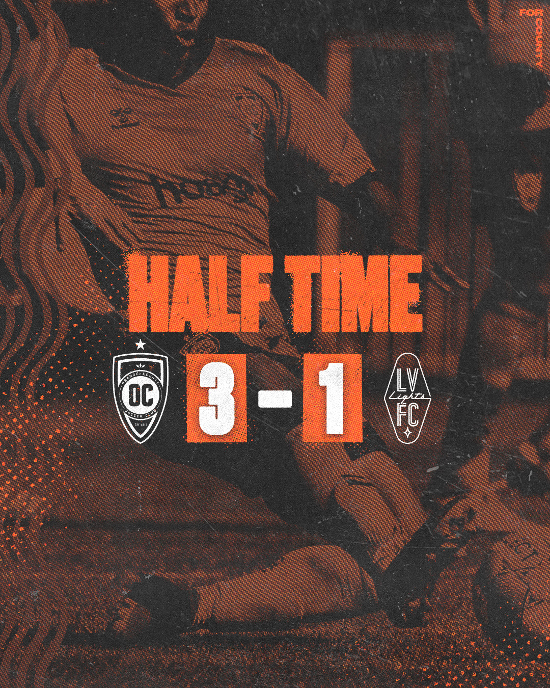
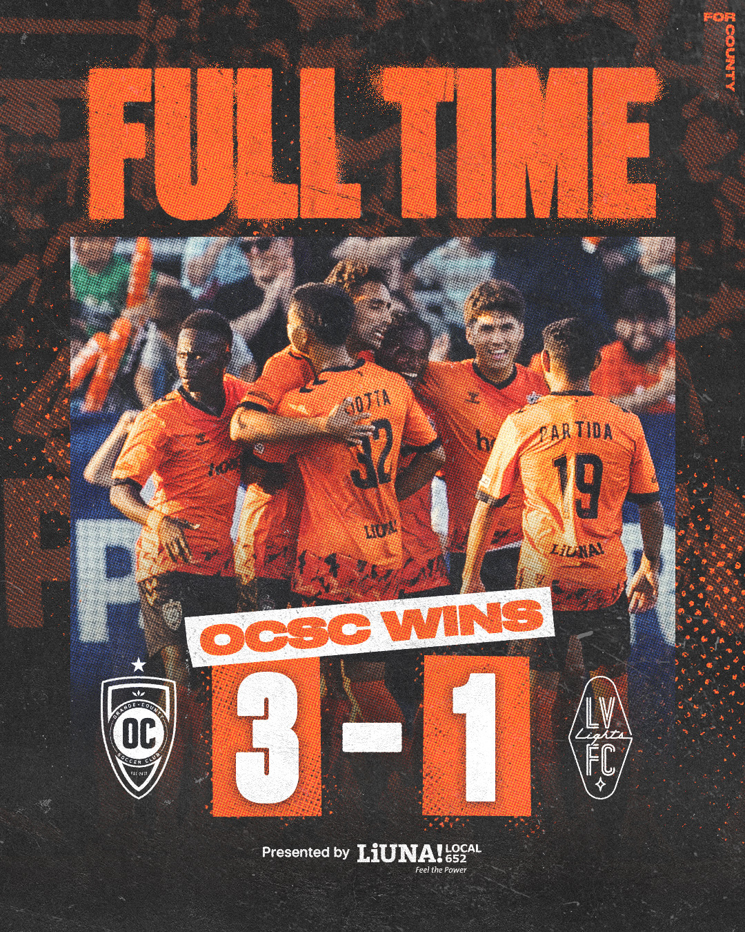
That became the source material, not a reference to nod to but the actual visual logic of the system. Headlines run as spray stencil type, rough at the edges, never clean. Photography gets the cutout treatment, players lifted out and dropped onto the page like a sticker on a skateboard, white border and all. Texture does a lot of the talking too: halftone grain, photocopier noise, checkerboard fields lifted straight off skate and punk graphics. Black sits as the dominant tone with orange as the hit, not the wallpaper, which flips how the brand used to lean.
It's the opposite of the slick, interchangeable look most clubs default to. In a league where every brand looks the same, OCSC now looks like it was made in someone's garage, on purpose.
EXECUTION
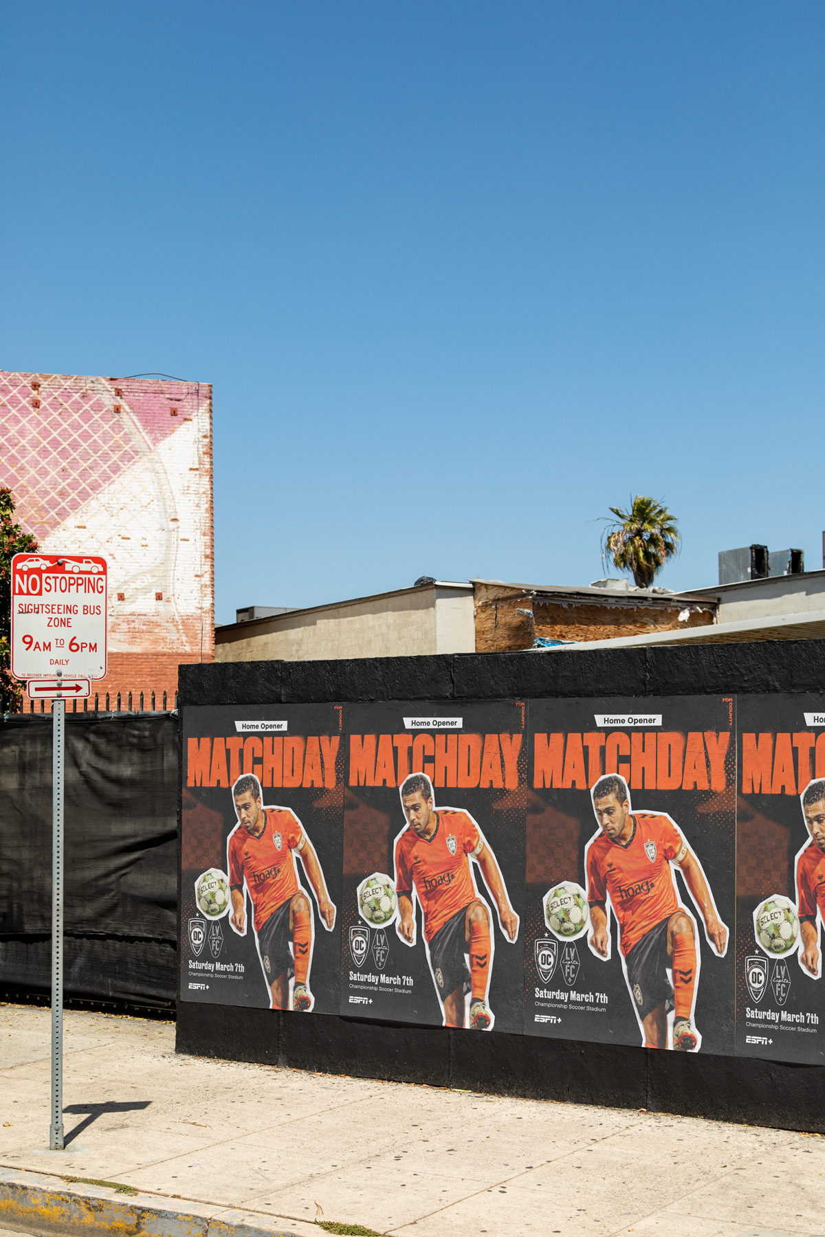
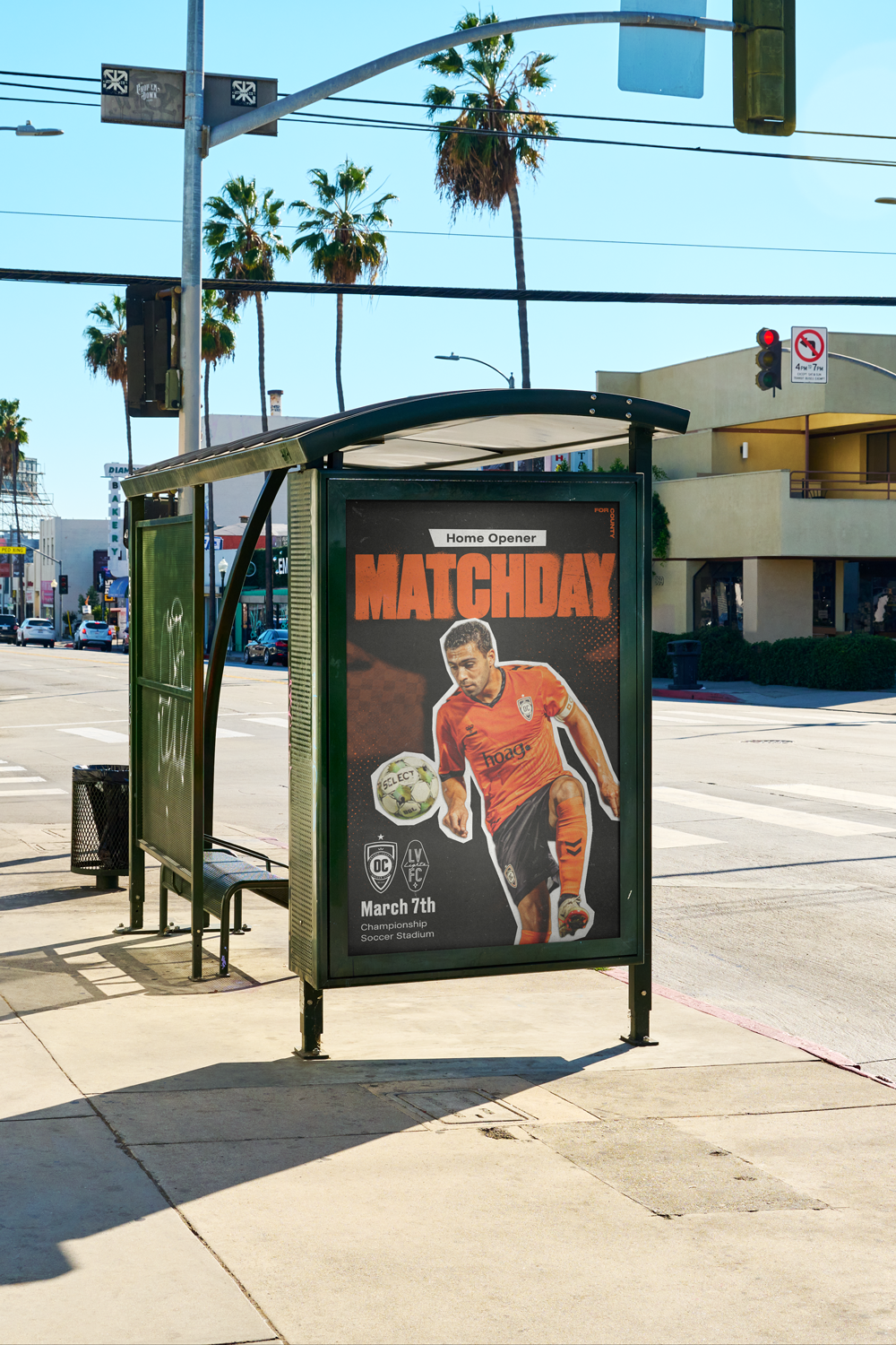
The system runs across the full matchday content suite: Matchday hype, March to the Match, Know Before You Go, Starting XI, Half Time, Full Time, Man of the Match, Team of the Week, Next Home Match. Same bones every time, same type, same texture, same cutout treatment, so the club is instantly recognisable whether it's a score update or a ticket push.
The real proof of concept happened off screen. The Home Opener Matchday design got wheatpasted across town, repeated in rows on a wall and slapped onto a bus shelter, the exact way punk show flyers used to cover Orange County streets. The brand isn't just referencing that history anymore, it's physically living in it.
CLIENT
Orange County Soccer Club
SERVICES
Creative Direction
Brand strategy